
Scaffold
大约 1 分钟
Scaffold
Scaffold实现了Material风格的基本布局结构,它提供了展示drawers、snack bars和bottom sheets的功能。
基本用法如下:
Scaffold(
  appBar: AppBar(
    title: Text('老孟'),
  ),
  body: Center(
    child: Text('一枚有态度的程序员'),
  ),
)
更多属性请查看AppBar控件详细说明,效果如下:
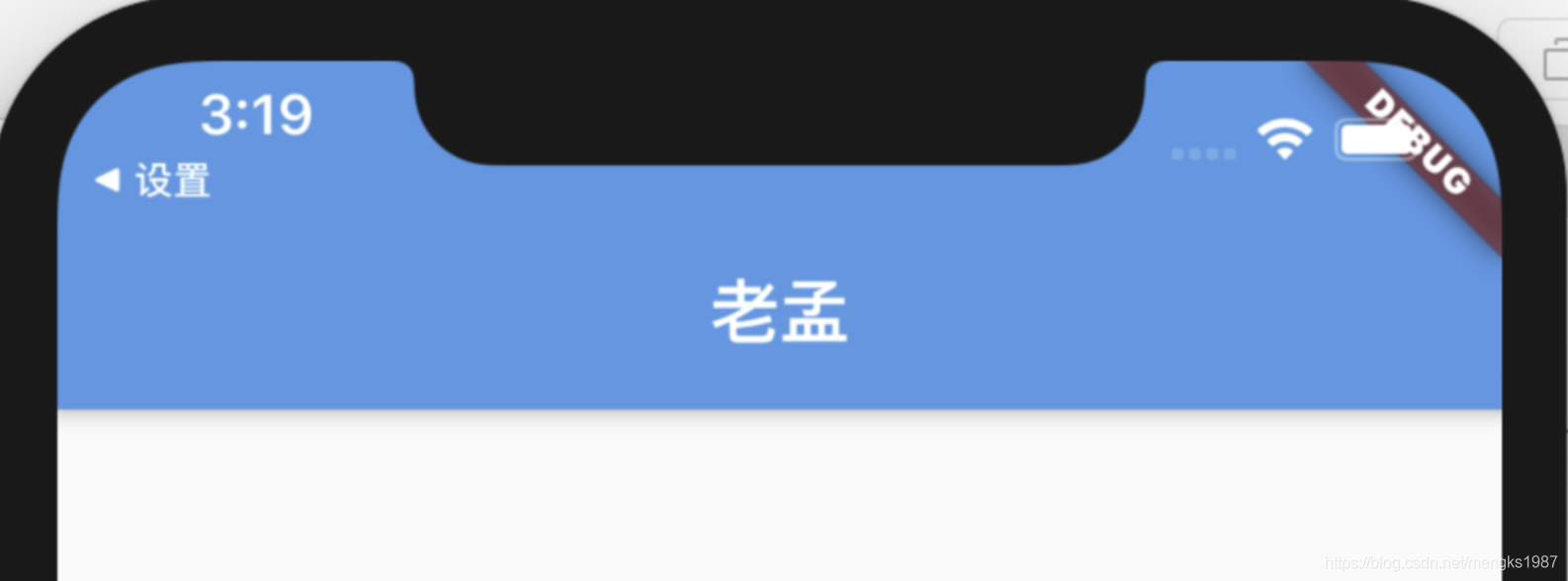
顶部蓝色区域就是appBar,通常设置AppBar。
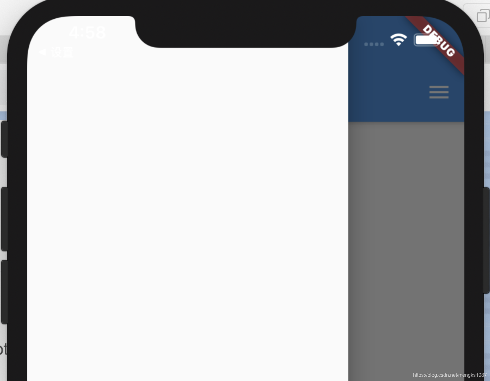
drawer和endDrawer分别表示从左边和右边出现的抽屉式控件,用法如下:
Scaffold(
  drawer: Drawer(),
  endDrawer: Drawer(),
  ...
)
更多属性请查看Drawer控件详细说明。
效果如下:
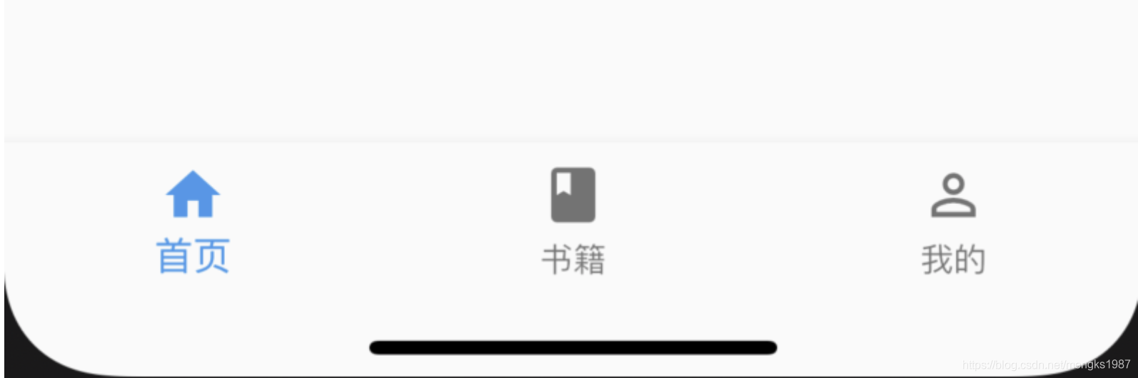
bottomNavigationBar表示底部导航,用法如下:
Scaffold(
  bottomNavigationBar: BottomNavigationBar(
    items: <BottomNavigationBarItem>[
      BottomNavigationBarItem(title: Text('首页'),icon: Icon(Icons.home)),
      BottomNavigationBarItem(title: Text('书籍'),icon: Icon(Icons.book)),
      BottomNavigationBarItem(title: Text('我的'),icon: Icon(Icons.perm_identity)),
    ],
  ),
  ...
)
更多属性请查看BottomNavigationBar控件详细说明。
效果如下:
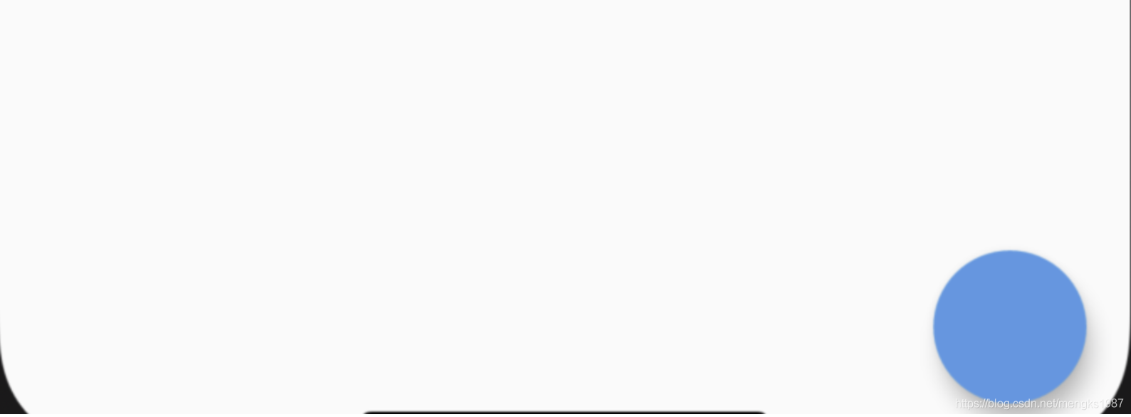
floatingActionButton默认位于右下角,
Scaffold(
  floatingActionButton: FloatingActionButton(),
)
效果如下:
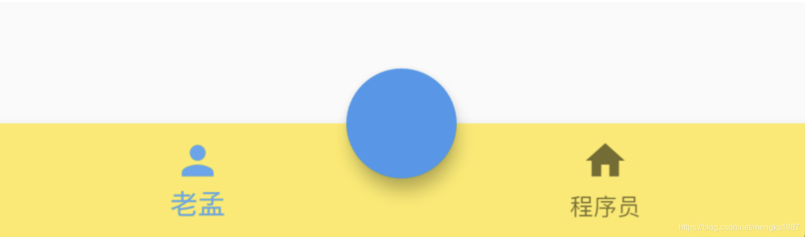
改变其位置,设置按钮嵌入底部导航栏:
Scaffold(
  floatingActionButtonLocation: FloatingActionButtonLocation.centerDocked,
  floatingActionButton: FloatingActionButton(),
  bottomNavigationBar: BottomNavigationBar(
    backgroundColor: Colors.yellow,
    items: [
      BottomNavigationBarItem(icon: Icon(Icons.person),title: Text('老孟')),
      BottomNavigationBarItem(icon: Icon(Icons.home),title: Text('程序员'))
    ],
  )
)
用法如下:
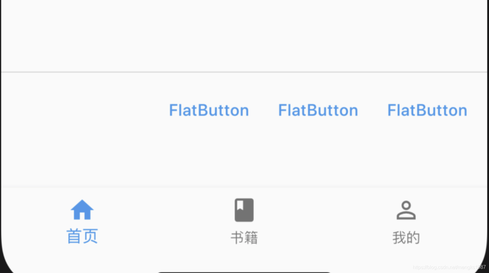
persistentFooterButtons位于body之下,bottomNavigationBar之上,不会随着body滚动而滚动,用法如下:
Scaffold(
  persistentFooterButtons: <Widget>[
    FlatButton(onPressed: (){},child: Text('FlatButton'),),
    FlatButton(onPressed: (){},child: Text('FlatButton'),),
    FlatButton(onPressed: (){},child: Text('FlatButton'),),
  ],
效果如下:
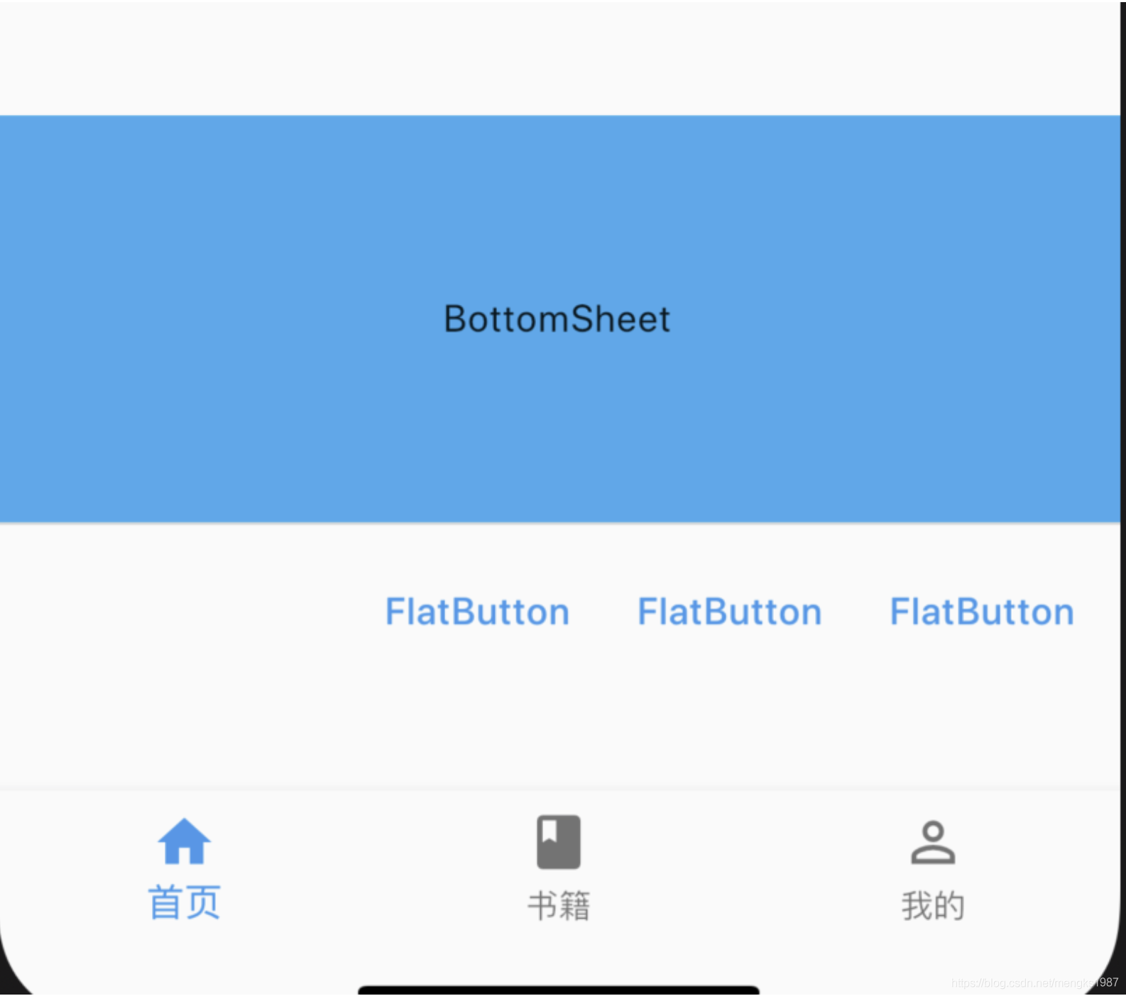
bottomSheet位于persistentFooterButtons之上,用法如下:
Scaffold(
  bottomSheet: BottomSheet(
      onClosing: () {},
      backgroundColor: Colors.lightBlue,
      builder: (context) {
        return Container(
          height: 150,
          alignment: Alignment.center,
          child: Text('BottomSheet'),
        );
      }),
      ...
 )
效果如下:
除了可以设置固定的bottomSheet外,还可以通过showBottomSheet方法弹出此控件,具体查看showBottomSheet的说明。