
AppBar
大约 2 分钟
AppBar
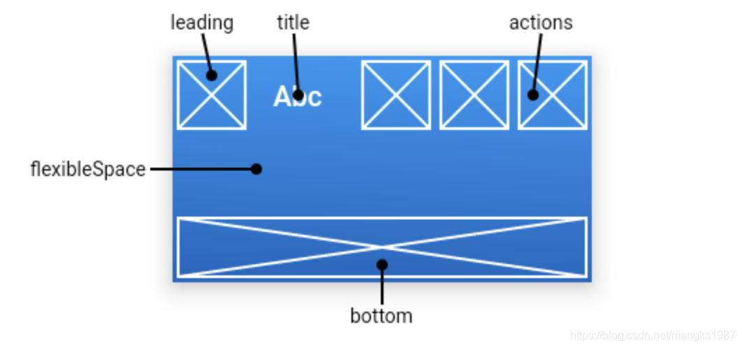
AppBar是material风格的应用程序栏,结构图如下:
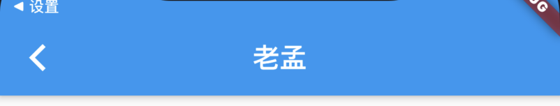
leading属性通常设置返回按钮,用法如下:
Scaffold(
  appBar: AppBar(
    leading: BackButton(),
    title: Text('老孟'),
  ),
)
效果如下:
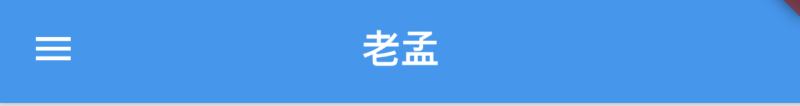
如果leading属性未设置,且Scaffold设置了Drawer则显示打开Drawer的图标,用法如下:
Scaffold(
  appBar: AppBar(
    title: Text('老孟'),
  ),
  drawer: Drawer(),
)
效果如下:
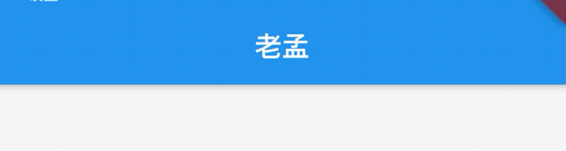
如果leading属性未设置,Scaffold也未设置Drawer,此时如果有前一个路由,则显示BackButton,设置如下:
Widget build(BuildContext context) {
return Scaffold(
appBar: AppBar(
title: Text('老孟'),
),
body: Center(
child: RaisedButton(
onPressed: () {
Navigator.push(context, MaterialPageRoute(builder: (context) {
return Scaffold(
appBar: AppBar(
title: Text('老孟1'),
),
);
}));
},
),
),
);
}
效果如下:
通过automaticallyImplyLeading属性改变其行为,设置为false将不会自动设置控件,用法如下:
AppBar(
  automaticallyImplyLeading: false,
  ...
)
title属性是应用栏上的标题,一般设置Text文本,用法如下:
AppBar(
  title: Text('老孟'),
)
注意title不一定是居中的,在Android平台默认是靠左的,设置居中代码如下:
AppBar(
  title: Text('老孟'),
  centerTitle: true,
)
actions在程序栏的右边,可以设置多个功能按钮,用法如下:
Scaffold(
  appBar: AppBar(
    title: Text('老孟'),
    actions: <Widget>[
      IconButton(icon: Icon(Icons.menu),onPressed: (){},),
      IconButton(icon: Icon(Icons.add),onPressed: (){},)
    ],
  )
效果如下:

flexibleSpace属性在AppBar中一般用不到,此控件和AppBar的height保持一致,只有在改变AppBar的尺寸的时候才会出现效果,因此一般用在SliverAppBar中。
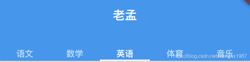
bottom属性通常请求下设置TabBar,用法如下:
Scaffold(
  appBar: AppBar(
    title: Text('老孟'),
    bottom:TabBar(
      tabs: <Widget>[
        Text('语文'),
        Text('数学'),
        Text('英语'),
        Text('体育'),
        Text('音乐'),
      ],
      controller: TabController(length: 5,vsync: this),
    )
  )
)
效果如下:
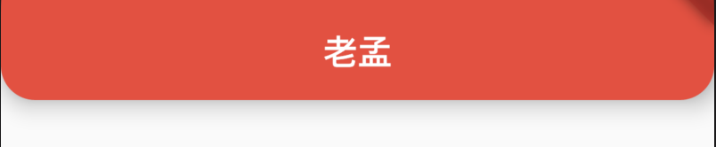
设置阴影、形状、背景颜色:
AppBar(
          elevation: 10,
          shape:
              RoundedRectangleBorder(borderRadius: BorderRadius.circular(20)),
          backgroundColor: Colors.red,
  )
效果如下:
设置icon样式及文字样式:
AppBar(
    iconTheme:IconThemeData(size: 24),
    actionsIconTheme: IconThemeData(size: 24),
    textTheme: TextTheme(title: TextStyle(color: Colors.red)),
    title: Text('老孟'),
  )