
BottomAppBar
大约 1 分钟
BottomAppBar
BottomAppBar通常用于Scaffold.bottomNavigationBar,并且可以在其顶部留出一个缺口给floatingActionButton使用。
用法如下:
Scaffold(
        bottomNavigationBar: BottomAppBar(
          child: Row(
            mainAxisAlignment: MainAxisAlignment.spaceAround,
            children: <Widget>[
              IconButton(
                icon: Icon(Icons.home),
              ),
              IconButton(
                icon: Icon(Icons.people),
              )
            ],
          ),
        ),
        floatingActionButton: FloatingActionButton(),
        floatingActionButtonLocation: FloatingActionButtonLocation.centerDocked,
  )
效果如下:

FloatingActionButton是悬浮在BottomAppBar上面,并没有嵌入里面,嵌入里面用法如下:
BottomAppBar(
  shape: CircularNotchedRectangle(),
  ...
)
增加BottomAppBar的形状,效果如下:

elevation参数为阴影值:
BottomAppBar(
  elevation: 8.0,
  ...
)
notchMargin参数表示缺口外边距:
BottomAppBar(
  notchMargin: 10,
  ...
)
效果如下:

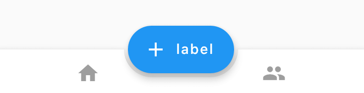
改变FloatingActionButton的形状为足球场形状,切嵌入的形状随之变化,代码如下:
Scaffold(
        bottomNavigationBar: BottomAppBar(
          shape: AutomaticNotchedShape(
              RoundedRectangleBorder(), StadiumBorder(side: BorderSide())),
          child: Row(
            mainAxisAlignment: MainAxisAlignment.spaceAround,
            children: <Widget>[
              IconButton(
                icon: Icon(Icons.home),
              ),
              IconButton(
                icon: Icon(Icons.people),
              )
            ],
          ),
        ),
        floatingActionButton: FloatingActionButton.extended(
          onPressed: () {},
          icon: new Icon(Icons.add),
          label: const Text("label"),
        ),
        floatingActionButtonLocation: FloatingActionButtonLocation.centerDocked,
      )
效果如下:
改为多边形:
Scaffold(
        bottomNavigationBar: BottomAppBar(
          shape: AutomaticNotchedShape(
              RoundedRectangleBorder(), BeveledRectangleBorder(borderRadius: BorderRadius.circular(10))),
          child: Row(
            mainAxisAlignment: MainAxisAlignment.spaceAround,
            children: <Widget>[
              IconButton(
                icon: Icon(Icons.home),
              ),
              IconButton(
                icon: Icon(Icons.people),
              )
            ],
          ),
        ),
        floatingActionButton: FloatingActionButton.extended(
          onPressed: () {},
          shape: BeveledRectangleBorder(borderRadius: BorderRadius.circular(10)),
          icon: new Icon(Icons.add),
          label: const Text("label"),
        ),
        floatingActionButtonLocation: FloatingActionButtonLocation.centerDocked,
      )
效果如下:

当然也可以改为棱形:
Scaffold(
        bottomNavigationBar: BottomAppBar(
          shape: AutomaticNotchedShape(
              RoundedRectangleBorder(), BeveledRectangleBorder(borderRadius: BorderRadius.circular(100))),
          ...
        floatingActionButton: FloatingActionButton.extended(
          onPressed: () {},
          shape: BeveledRectangleBorder(borderRadius: BorderRadius.circular(100)),
          icon: new Icon(Icons.add),
          label: const Text("label"),
        ),
        ...
      )
效果如下:

我们可以通过此控件定义任何我们想要的效果。